
European home décor is moving toward products that feel personal, thoughtfully designed, and easy to integrate into different living spaces. For wholesalers and retailers, this creates an interesting opportunity: decorative vases no longer need to rely on elaborate patterns or bold ornamentation to attract attention. Sometimes, a carefully blended transition from one color to another is enough to make an ordinary shelf feel more considered.
This is where gradient ceramic vases come in.
From soft beige fading into warm brown to pale blue deepening into ocean-inspired tones, gradient finishes offer visual depth without necessarily making a room feel busy. They can work in minimalist interiors, contemporary living rooms, boutique hotels, gift collections, and seasonal home décor displays.
For European buyers, however, following a design trend is only part of the decision. A vase also needs to fit the target price range, photograph well for e-commerce, complement existing collections, and maintain a consistent appearance when ordered in bulk.
So, what are the latest gradient ceramic vase trends in European wholesale, and how can buyers turn these design directions into a commercially viable product range?
This guide explores the colors, finishes, silhouettes, retail applications, and sourcing considerations that matter when developing a gradient vase collection for the European market.
1. What Are the Latest Gradient Ceramic Vase Trends in Europe?
The latest direction is not simply about making one color fade into another. It is about using color transitions to create atmosphere, emphasize shape, and give decorative objects more personality.
Current European home décor trend coverage points toward sculptural forms, expressive statement pieces, handmade-looking finishes, and colors that work together across an entire room. Messe Frankfurt’s 2026 interior and décor trend coverage highlights sculptural lighting, statement objects, and artisan-style ceramics as relevant directions for retailers.

For gradient vase buyers, these developments translate into several practical design opportunities.
Soft, earthy gradients for everyday home décor
Warm neutrals remain a useful starting point for buyers who want a collection with a relatively long selling window.
Think of a vase that transitions from creamy ivory at the neck to sand beige around the middle and muted terracotta near the base. Another option is a warm taupe gradient that gradually deepens into cocoa brown.
These color combinations feel connected to natural landscapes rather than a single short-lived color trend. They are also easy to merchandise alongside wooden furniture, linen textiles, neutral tableware, and understated decorative accessories.
For European home décor wholesalers, this type of neutral gradient ceramic vase for modern living rooms can serve as a core product rather than a design reserved for one seasonal campaign.
The key is restraint. If the color transition is too sharp, the vase may look more graphic than sophisticated. A gradual change, especially when paired with a simple silhouette, often creates a more balanced result.
Muted green and blue transitions
Green and blue offer another promising direction, particularly for collections built around botanical styling, coastal interiors, and calm living spaces.
Popular design possibilities include:
- Sage green fading into warm ivory.
- Olive green gradually deepening into forest green.
- Pale blue transitioning into muted teal.
- Dusty blue blending into a deeper blue-gray.
- Seafoam green fading into a soft sand tone.
These combinations allow buyers to introduce color without relying on highly saturated finishes.
A gradient glazed ceramic vase in sage green can complement leafy plants and natural wood furniture, while a blue-to-teal design can provide a stronger visual accent in a neutral room.
For retailers, the advantage is flexibility. The same general color family can be developed across several vase shapes, creating a coordinated display without making every item look identical.
Sculptural silhouettes with visible color movement
Color gradients become more interesting when they follow the shape of the product.
On a tall, narrow vase, the transition can emphasize verticality. On a rounded vase, a darker lower section can visually ground the shape. On a gently flared vessel, a lighter neck and deeper body can create a softer focal point.
This connects with a wider design direction toward decorative objects that work as standalone visual statements. Messe Frankfurt’s 2026 vase trend article discusses sculptural vases, expressive shapes, and decorative pieces designed to attract attention even when displayed without flowers.
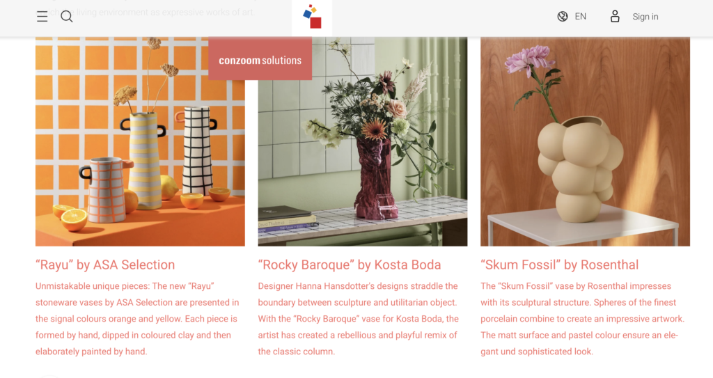
For buyers, this means a gradient vase does not always need an elaborate pattern. The combination of silhouette and color can provide enough visual interest.
A sculptural gradient ceramic vase for contemporary interiors is especially worth considering for design-led retailers, lifestyle stores, and home décor collections positioned above the entry-level price range.
Subtle gradients with a handmade appearance
Perfectly smooth color transitions are not the only option.
Some collections may benefit from a softer, more artisanal finish in which the transition appears slightly organic rather than mechanically uniform. A gentle variation around the shoulder or base can give a vase more visual depth.
The important distinction is between intentional variation and uncontrolled inconsistency.
For OEM and wholesale buyers, the desired appearance should be established before production. If a collection is intended to have a handcrafted look, the acceptable range of color variation still needs to be defined. Otherwise, the first production batch may look attractive while repeat orders appear noticeably different.
This is particularly important for retailers selling matching vase sets or maintaining a consistent product image across multiple sales channels.
Glossy gradients and softly reflective finishes
Glossy gradient vases remain an option for collections that need a more polished, eye-catching appearance.
A deep blue glaze fading into pale blue, for example, can create a sense of depth as light moves across the curved surface. A warm amber-to-cream transition can bring visual warmth to autumn and winter displays.
Glossy finishes can be particularly effective in online product photography because reflections help reveal the contours of a vase. However, lighting and camera angles can also exaggerate differences between samples and finished stock.
Buyers should therefore review physical samples under more than one lighting condition rather than approving a glaze based only on a digitally edited image.
For a wholesale assortment, a useful approach is to balance glossy statement pieces with quieter finishes. This gives retailers options for customers who prefer either a stronger decorative accent or a more understated look.
2. Which Gradient Colors Have the Strongest Wholesale Potential?
There is no single color combination that will perform equally well in every European market or retail channel. A design that suits a contemporary lifestyle store may not be the best choice for a traditional gift shop.
Instead of treating every trending color as a separate product opportunity, buyers can organize their collections around a few clear color stories.
Warm neutrals: the core collection
Cream, beige, sand, taupe, and muted brown are useful foundations for an assortment intended to remain relevant beyond a single season.
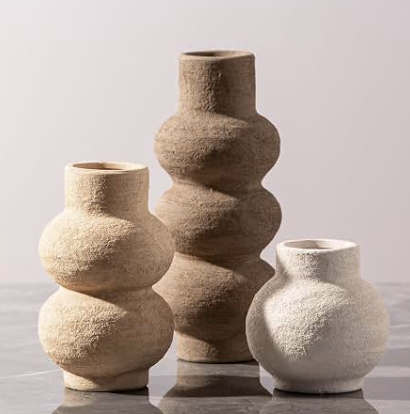
A vase transitioning from ivory to sand, for example, can be displayed throughout the year. It can also be combined with other products without requiring the retailer to redesign an entire display around one strong color.
This makes wholesale gradient ceramic vases in neutral tones a sensible starting point for buyers who want to test a new finish without committing to an unusually bold palette.
Earthy pink and terracotta: warmth with character
Dusty rose, muted peach, clay red, and terracotta offer more personality while remaining relatively easy to style.
These gradients can suit romantic gift collections, contemporary rustic interiors, and autumn-inspired displays. A pale blush neck fading into a terracotta base is one example of a design that feels warm without becoming overly decorative.
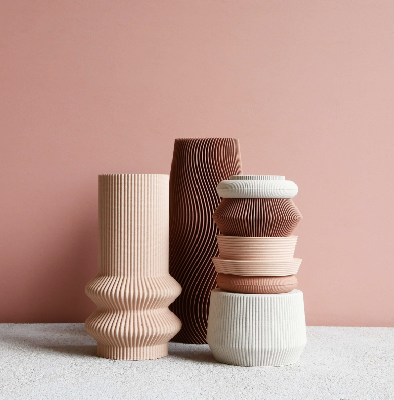
The commercial consideration is how the color reads across the full assortment. If every vase has a strong pink or orange cast, the collection may become difficult to combine with other home accessories.
A small number of warm statement pieces can provide enough contrast.
Green gradients: botanical and nature-inspired styling
Green shades are a natural fit for retailers whose customers are interested in plants, natural interiors, or relaxed living spaces.
A light sage-to-olive gradient may appeal to buyers seeking subtle color, while a teal-to-forest-green transition offers a more dramatic alternative.
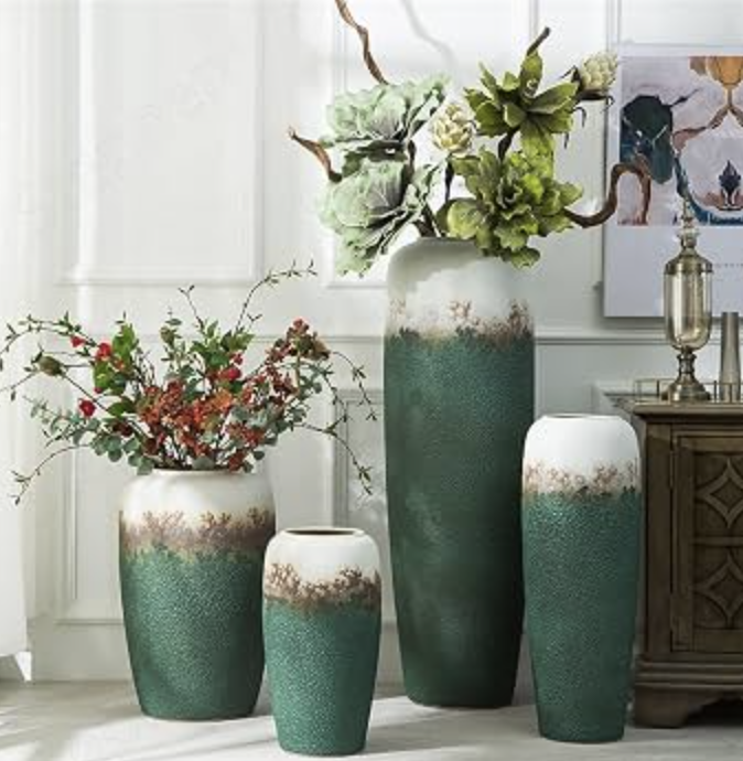
For a coordinated product range, the same glaze concept can be tested on a tall floor vase, a medium tabletop vase, and a smaller decorative vessel. The different proportions allow the color to behave differently without introducing an entirely new design language.
Blue gradients: coastal and contemporary collections
Blue gradients are useful when a collection needs a cooler visual direction.
Pale blue, dusty blue, teal, and blue-gray can work across coastal-inspired décor, modern apartments, and gift assortments. Darker transitions generally create a stronger focal point, while pale transitions can feel lighter and more understated.
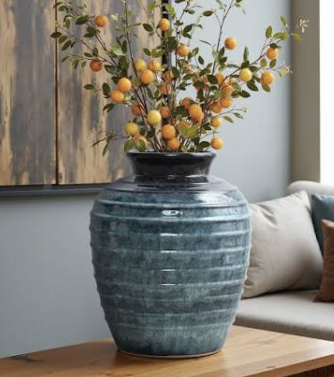
Buyers should be careful not to choose a shade solely because it looks attractive in a supplier’s showroom. The color needs to work with the retailer’s wider assortment, photography style, and intended customer profile.
How buyers should prioritize these colors
For an initial wholesale collection, it is usually more practical to select a small number of complementary color stories than to launch every possible gradient combination.
The following comparison can help buyers decide where each design direction fits.
| Gradient direction | Visual character | Suitable retail positioning | Main buying consideration |
|---|---|---|---|
| Ivory to sand | Quiet, warm, understated | Everyday home décor and broad retail assortments | Keep the transition soft and the finish easy to coordinate |
| Beige to terracotta | Earthy and welcoming | Lifestyle stores and seasonal displays | Check that the darker base does not overpower the design |
| Blush to clay pink | Soft, expressive, gift-friendly | Gift shops and design-led collections | Confirm the shade looks consistent under different lighting |
| Sage to olive | Botanical and relaxed | Plant-related décor and contemporary interiors | Match the green undertones across the collection |
| Pale blue to teal | Fresh and contemporary | Coastal-inspired and modern décor ranges | Check color depth and gradient placement |
| Deep blue to blue-gray | Dramatic and sophisticated | Statement pieces and premium-looking displays | Review glaze uniformity and reflective highlights |
These are practical assortment-planning directions, not a ranked sales report. Buyers should validate them against their own customer base, price points, and previous sales performance before committing to large quantities.
3. Which Gradient Vase Shapes Are Worth Adding to a Wholesale Collection?
Color attracts attention, but shape often determines whether a vase fits the customer’s home.
A well-planned wholesale collection should include more than one silhouette. Different heights, openings, and body proportions allow retailers to create displays that look complete while giving customers practical choices.
Tall, slender gradient vases
Tall vases work well beside consoles, on shelves with sufficient clearance, and in larger living areas.
A gradual transition from a pale neck to a darker lower body can emphasize the vase’s height. This is especially effective when the silhouette is simple and the glaze provides the main decorative feature.
For wholesale buyers, tall designs can serve as statement pieces within a collection. Before ordering, however, check the base diameter, overall stability, shipping carton dimensions, and the height of the vase relative to common retail shelving.
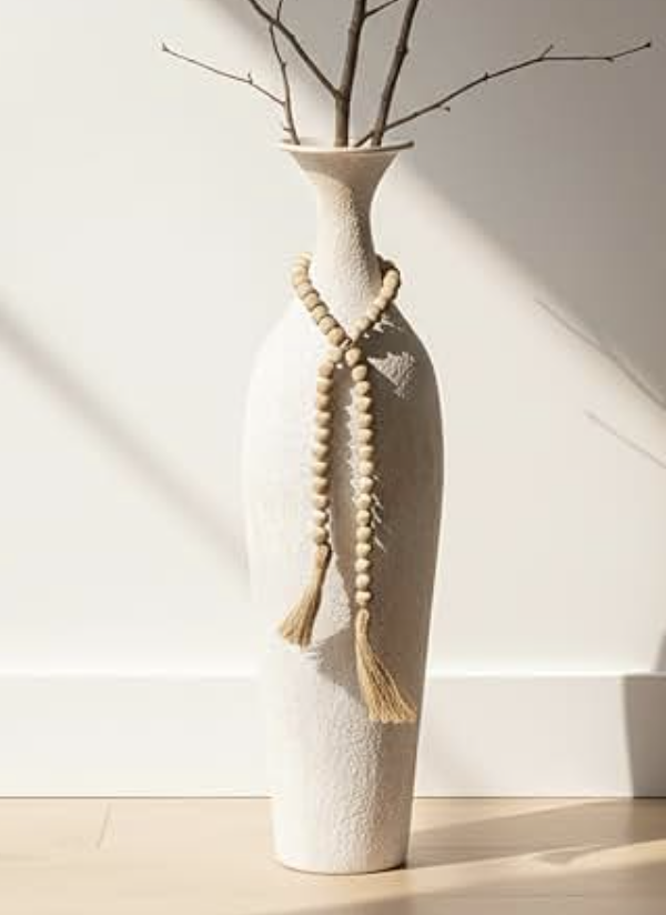
A tall vase with a narrow base may look elegant in a photograph but feel less suitable for busy retail environments or homes with limited display space.
Rounded and bulbous vases
Rounded shapes provide a different visual effect. Their larger body creates more room for a gradual color transition, making them suitable for two-tone and multi-tone designs.
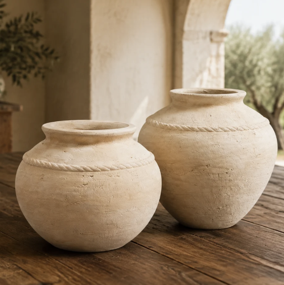
For example, a pale cream neck can transition into a warm brown body, with the darkest shade concentrated near the base. Alternatively, a sage-to-olive gradient can follow the curvature of the vessel.
These designs can work as standalone decorative objects or as part of a group of differently sized vases.
A rounded gradient ceramic vase for tabletop decoration is worth considering for furniture stores, gift retailers, and e-commerce sellers who need a product that can be photographed clearly against a simple background.
Bottle-shaped vases
Bottle-shaped designs generally have a narrower neck and a more compact opening. This creates a natural focal point and can make a gradient appear more concentrated around the body.
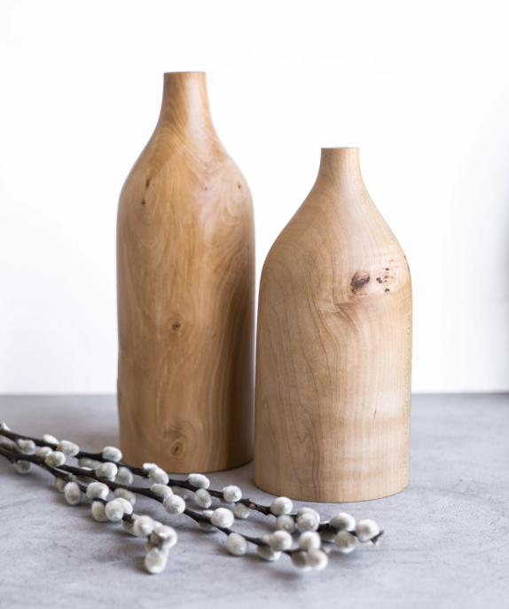
They can be useful for single stems, dried flowers, or minimalist arrangements, depending on the opening and product specifications.
For buyers, the important question is whether the vase is intended for practical flower arrangements, purely decorative use, or both. If it is expected to hold fresh flowers, water resistance and ease of cleaning should be confirmed during product development.
Wide-mouth and statement vases
Wide-mouth vases can accommodate fuller arrangements and provide more visual volume.
Their broader shoulders also create opportunities for layered color effects. A light upper section and deeper lower section can highlight the vase’s proportions, while a gradient that follows the shoulders can make the overall design feel more fluid.
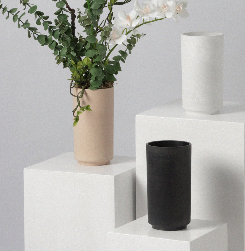
These products may suit larger home décor displays, furniture retailers, and interior styling projects.
The main consideration is proportion. A wide body paired with a short neck can make a strong visual statement, but the final design should still feel balanced when viewed from the front and side.
Should buyers offer matching sets?
Matching sets can increase the flexibility of a collection, particularly when the products share a color story but vary in height and shape.
A practical three-piece range might include:
- One tall vase for a focal display.
- One medium rounded vase for a console or tabletop.
- One small bottle-shaped vase for shelves or gift purchases.
The goal is not to make all three products identical. Instead, the gradient, glaze character, and overall design language should connect them.
For cross-border e-commerce sellers, coordinated sets may also create opportunities for bundled listings. However, shipping dimensions, packaging costs, and the risk of breakage need to be calculated before deciding whether to sell the pieces individually or together.
4. How European Retailers Can Merchandise Gradient Ceramic Vases
A good product can lose its appeal if it is displayed without a clear visual story. Gradient vases benefit from merchandising that helps customers understand the color transition and imagine the product in their own homes.
Build displays around a color family
Rather than arranging products randomly, retailers can group vases by related colors.
A display might combine ivory-to-sand, beige-to-terracotta, and blush-to-clay pink designs. The shades are different enough to create variety but close enough to form a coherent visual sequence.
Another display could combine sage-to-olive and pale-blue-to-teal pieces for a cooler, nature-inspired look.
This approach is useful for physical stores because customers can compare finishes side by side. It also makes product photography more consistent for online stores.
Use different heights to create visual rhythm
Three vases with identical heights may look repetitive, even if their colors differ.
A more effective arrangement often combines one taller piece with one or two shorter designs. The tallest vase creates a focal point, while the smaller products fill out the composition.
For online retailers, the same principle can be used in lifestyle photographs. A primary product image should show the vase clearly, while secondary images can demonstrate scale, surface details, and how the design looks with flowers or branches.
Show the gradient clearly in product photography
Gradient finishes can be difficult to communicate through photographs when lighting is too strong or the background is too similar to the product.
A cream-to-beige vase photographed against a warm beige wall, for instance, may lose its color definition. A darker gradient can also look almost black if shadows are too heavy.
For a stronger product listing, buyers should request images that show:
- The full vase against a clean background.
- A close-up of the glaze transition.
- The product in a styled interior.
- The vase beside a familiar object or with dimensions clearly provided.
- The finish under neutral lighting, without excessive color editing.
These details help customers understand what they are purchasing and can reduce confusion about the actual shade.
Offer a useful balance between core products and statement pieces
A wholesale assortment does not need to consist entirely of unusual designs.
Core products with neutral gradients can provide continuity, while a smaller number of expressive shapes or deeper colors can bring freshness to the display.
This gives retailers a way to refresh their assortment without replacing every existing product. It also allows buyers to evaluate demand for more distinctive finishes before expanding the range.
5. Five European Home Décor Brands Worth Studying for Design Inspiration
For buyers developing a gradient ceramic vase collection, established European home décor brands can offer useful references for product styling, collection structure, and presentation.
The following brands are included as design references, not as a ranking of gradient vase manufacturers. Their broader design language can help buyers identify the kind of collection they want to build.
Ferm Living — Denmark
Ferm Living is known for contemporary home accessories, furniture, and decorative objects that combine modern shapes with softer, organic influences.
Its design language is useful for buyers exploring restrained colors, sculptural forms, and coordinated home décor collections. When developing a gradient vase range, buyers can study how a decorative object fits into a larger interior story rather than treating the vase as an isolated product.
Official website: Ferm Living
House Doctor — Denmark
House Doctor offers home accessories and interior products with an eclectic, contemporary character.
For wholesale buyers, the brand provides a useful reference for combining understated products with more expressive accents. A gradient vase collection inspired by this general approach could mix neutral colors with a small number of stronger finishes while maintaining a cohesive retail presentation.
Official website: House Doctor
Bloomingville — Denmark
Bloomingville is associated with Nordic-inspired home décor, decorative accessories, and products designed to create a warm, lived-in atmosphere.
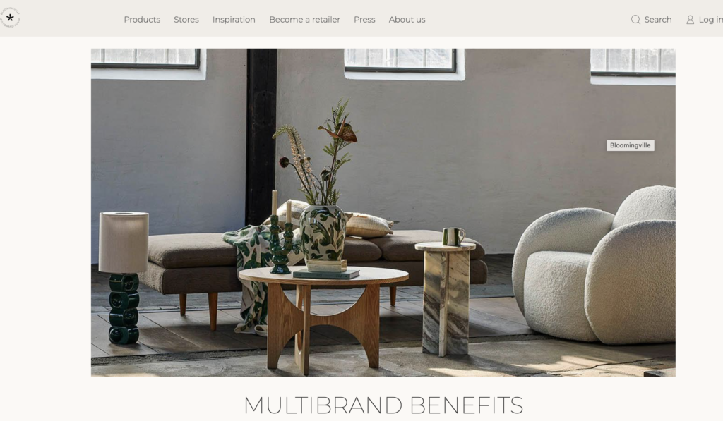
Buyers can study how different shapes, textures, and color palettes work together within a broader assortment. This is particularly relevant when planning matching gradient vases in several sizes, rather than sourcing one attractive but isolated design.
Official website: Bloomingville
Broste Copenhagen — Denmark
Broste Copenhagen has a design identity influenced by Nordic interiors, muted colors, and understated decorative styling.
Its overall aesthetic can be a useful reference for buyers considering soft transitions between sand, gray, beige, and earthy tones. Such color families can help create a collection that feels connected without requiring every vase to have the same shape.
Official website: Broste Copenhagen
Räder Design — Germany
Räder Design is known for decorative gifts and home accessories with a distinctive, often delicate and thoughtful visual style.
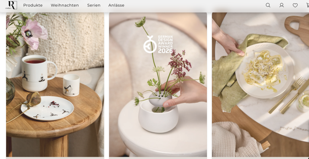
For gift retailers, this offers a useful reminder that a product’s appeal depends not only on its shape or finish but also on how it fits into a gifting occasion. A gradient vase collection can be developed with this in mind through coordinated sizes, gift-ready packaging, and color choices suitable for different occasions.
Official website: Räder Design
These brands serve different audiences and are not all specialists in gradient ceramic vases. The value of studying them lies in understanding how European home décor collections communicate a consistent design identity. Buyers should verify current product ranges directly before using any specific item as a sourcing benchmark.
6. What Should Buyers Check Before Ordering Gradient Ceramic Vases in Bulk?
A sample may look excellent on a desk, but a wholesale order has to meet a different standard. Once a design is produced in quantity, the buyer needs to consider finish consistency, product dimensions, packing efficiency, and repeat-order reliability.
Gradient designs deserve particular attention because the transition between colors is part of the product’s identity.
Color consistency between samples and production
Before approving a design, buyers should agree on the main color references and the intended position of the gradient.
For example, does the lighter color end at the shoulder, the middle of the body, or near the base? Is the transition gradual, or should there be a more visible boundary between the two shades?
These details should be documented using an approved physical sample and, where practical, reference photographs under agreed lighting conditions.
It is also worth clarifying the acceptable level of variation between individual pieces. Ceramic glazing and firing can introduce variations, so the buyer and manufacturer should agree on realistic quality requirements rather than relying on a vague instruction such as “make every vase exactly the same.”
Glaze finish and surface quality
A gradient can be applied in different ways, and each method may produce a different visual effect.
A smooth transition can create a clean, contemporary appearance. A layered or more textured finish can make the color appear deeper and less uniform.
Regardless of the chosen effect, buyers should check for defects such as unwanted glaze runs, rough patches, visible imperfections, and inconsistent coverage. For glossy products, inspect the reflection across the curved body. For matte products, check whether the surface appears even and appropriate for the intended use.
The finished vase should match the agreed specification, not simply look attractive in a single photograph.
Dimensions, capacity, and product function
The product description should clearly state the vase’s height, maximum width, opening diameter, and other relevant dimensions.
If the vase is intended to hold fresh flowers, ask whether the interior is glazed and whether the finished product has been tested for water retention. Decorative vessels designed for dried flowers may have different functional requirements.
These details matter for both retail accuracy and customer satisfaction. They also help e-commerce sellers create product pages with reliable specifications.
Packaging and transport protection
Gradient vases often rely on a carefully finished exterior, so surface scratches, chipped rims, and damaged bases can affect the perceived value of the product.
Before placing a large order, buyers should review the proposed inner packaging, protective materials, carton strength, and the way the vase is secured inside the box.
For online sellers, individual protective packaging may be necessary because products pass through multiple handling stages. For distributors supplying physical stores, carton efficiency and reliable stacking can be equally important.
Packaging should be evaluated alongside the product cost, not treated as an afterthought.
Minimum order quantities and repeatability
A supplier’s minimum order quantity can influence how much inventory a buyer needs to hold, particularly when several colors and sizes are involved.
Before confirming an order, clarify whether the MOQ applies per design, per color, or to the combined collection. Also ask how repeat orders will be managed and whether the approved glaze reference can be retained for future production.
For a new gradient vase range, a smaller initial assortment with a clear expansion plan may be more practical than ordering many colors at once.
Cost, lead time, and shipping dimensions
The quoted unit price is only one part of the purchasing decision.
Buyers should also consider sample costs, packaging, carton dimensions, shipping arrangements, production lead times, and any destination-specific import requirements that apply to their business.
A larger sculptural vase may have a higher shipping cost than its unit price initially suggests. Likewise, a coordinated set may look attractive at retail but require more protective packaging.
A complete landed-cost calculation helps buyers compare options on a more realistic basis.
7. How OEM and ODM Can Help Buyers Develop a Distinctive Gradient Vase Collection
For retailers and brands that want a recognizable assortment, customization can be more useful than simply selecting a standard design from a catalogue.
OEM and ODM arrangements offer different ways to approach product development, depending on how much of the design has already been established.
OEM: develop products around an approved specification
OEM projects are useful when the buyer already has a clear product concept, design reference, or specification.
For a gradient vase, this may include an agreed silhouette, dimensions, color combination, glaze finish, logo placement, and packaging requirements.
The objective is to turn the approved concept into a production-ready item that meets the buyer’s requirements. A detailed specification is especially important when the product relies on a particular gradient position or color transition.
ODM: explore designs with a manufacturing partner
ODM can be useful when a buyer knows the target market and desired style but needs help developing the actual product concept.
For example, a retailer may want a coordinated collection of neutral gradient vases for contemporary European interiors without having finalized the shapes or exact colors.
The development process could explore several silhouettes, glaze samples, and color combinations before narrowing the range to a practical assortment.
In either arrangement, buyers should confirm design ownership, tooling arrangements where applicable, sample approval procedures, production tolerances, and the terms for repeat orders.
Start with a collection, not just one product
A commercially useful collection usually has a clear internal structure.
One possible development plan is to begin with three related silhouettes and two complementary color stories. The buyer can then evaluate which combinations best match the target market and price point.
This creates several advantages:
- The products share a recognizable visual identity.
- Retailers can display the vases together or separately.
- E-commerce sellers can test individual products and coordinated sets.
- Future launches can build on the original design language.
The final assortment should be guided by actual customer demand, not simply by the number of variations a factory can produce.
8. How to Reduce Risk When Launching a New Gradient Vase Range
A new design direction always involves some uncertainty. The most useful approach is to treat the first order as a structured market test.
Start by defining the intended customer. A home décor chain, an independent gift shop, and an online marketplace seller may have very different expectations for color, size, packaging, and price.
Next, select a manageable range of products. Choose a small group of complementary colors and shapes that can be presented as one collection.
Request physical samples and evaluate them under realistic conditions. Check the glaze transition, stability, dimensions, packaging, and the way the products appear in photographs.
Before placing a bulk order, establish written approval criteria for the sample and finished production. Confirm the MOQ, delivery schedule, packaging specifications, and arrangements for handling quality issues.
After launch, review customer feedback, sell-through, returns, and the performance of each color and shape. Use this information to decide which items deserve a repeat order and which should be revised.
This approach helps buyers avoid committing too much inventory to a trend before they understand how their customers respond.
9. The Future of Gradient Ceramic Vases in European Wholesale
Gradient ceramic vases offer a flexible way to introduce color, depth, and visual character into home décor collections.
The strongest opportunities are not necessarily the most complicated designs. Soft neutral transitions can support everyday retail assortments, earthy gradients can add warmth, and blue or green combinations can give contemporary collections a clearer identity. Sculptural shapes and carefully controlled glaze effects can further distinguish a product without relying on excessive decoration.
For European wholesale buyers, the practical priority is to connect design choices with a clear commercial plan. A good gradient vase should look appealing in a display, photograph accurately online, meet the intended price point, and remain consistent enough for repeat orders.
Rather than following every new color trend, buyers can focus on a coherent collection that combines core designs with a few distinctive statement pieces.
For brands and retailers looking to develop their own range, working with an experienced manufacturing partner can help turn those design ideas into products that are suitable for real-world retail requirements.
Hale is a China-based ceramic factory specializing in ceramic flowerpots, ceramic vases, candle jars, and home décor items. Hale provides OEM and ODM production services for global home and garden brands, wholesalers, distributors, gift businesses, and cross-border e-commerce sellers. Buyers developing a gradient ceramic vase collection can discuss custom colors, shapes, finishes, and product specifications to build a range suited to their target market.
The aim is simple: create products that look distinctive on the shelf, make sense for the buyer’s business, and can support a consistent collection over time.
Frequently Asked Questions
1. What is a gradient ceramic vase?
A gradient ceramic vase is a decorative vessel featuring a gradual transition between two or more colors. The transition may run vertically from the neck to the base, follow the curves of the body, or blend several related shades across the surface.
2. Which gradient colors are suitable for European wholesale buyers?
Warm neutrals, earthy pinks, terracotta, sage green, olive, pale blue, teal, and blue-gray are useful directions to explore. The best choice depends on the retailer’s target customers, overall assortment, price point, and preferred interior style.
3. Are gradient ceramic vases suitable for year-round retail?
Yes. Neutral gradients and understated earthy tones can be used in year-round home décor collections, while stronger colors and distinctive silhouettes can support seasonal launches. Actual performance should be evaluated using the retailer’s sales data and customer feedback.
4. What vase shapes work best with gradient glazes?
Tall slender vases emphasize vertical color transitions, rounded vases provide a larger area for blending colors, and bottle-shaped vases create a more concentrated focal point. Wide-mouth and sculptural vases can also work well when the gradient complements the overall proportions.
5. Can buyers customize gradient ceramic vases through OEM or ODM?
Yes, depending on the manufacturer’s capabilities and project requirements. Customization may include shape, dimensions, glaze colors, gradient placement, surface finish, logo application, and packaging. Buyers should confirm the available options and approve a physical sample before bulk production.
6. How can buyers maintain consistent gradient colors in bulk orders?
They should approve a physical reference sample, document the color combination and transition placement, establish acceptable production tolerances, and agree on quality inspection procedures. Lighting conditions should also be considered when evaluating samples and finished products.
7. What should wholesalers check before ordering gradient ceramic vases?
Key considerations include product dimensions, glaze quality, sample-to-production consistency, MOQ, packaging protection, lead time, shipping dimensions, and repeat-order arrangements. If the vase is intended to hold fresh flowers, water resistance should also be verified.
8. Are gradient ceramic vases suitable for online stores and cross-border e-commerce?
They can be suitable because the color transition provides a clear visual feature for product photography and collection building. Sellers should provide accurate color images, dimensions, usage information, and protective packaging to help manage customer expectations and reduce transit damage.
9. How many colors should a new gradient vase collection include?
There is no universal number. For an initial launch, buyers can consider a small, coordinated palette with a few complementary shapes, then expand based on customer response and sales performance. The right range depends on the budget, MOQ, inventory strategy, and retail channel.
10. Where can buyers source OEM and ODM gradient ceramic vases from China?
Buyers can contact ceramic manufacturers that offer custom glaze development, shape selection, sample approval, quality control, and export packaging. Before committing to an order, they should verify the manufacturer’s capabilities, review physical samples, and agree on the product specifications and commercial terms.
